
Special-Style
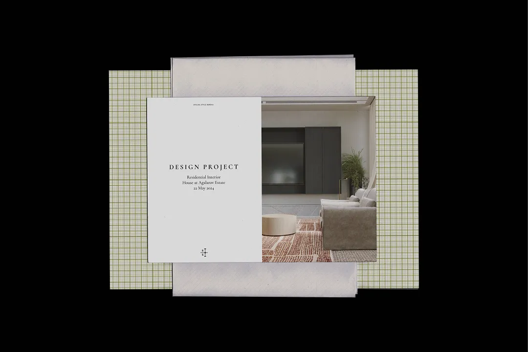
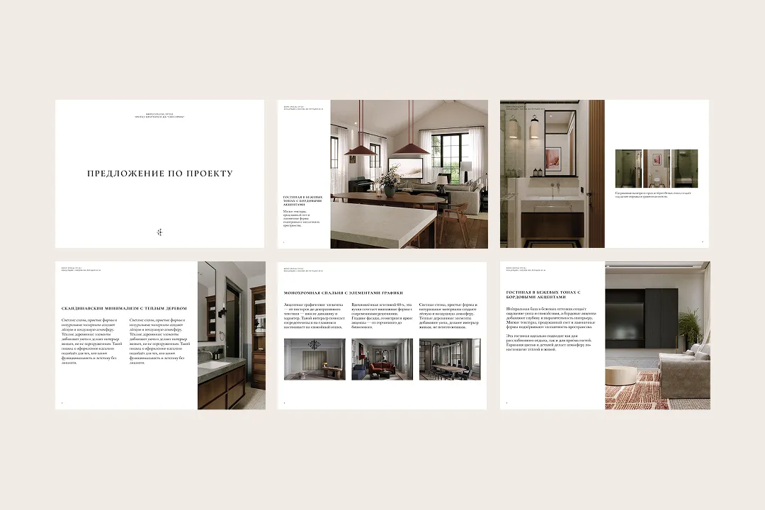
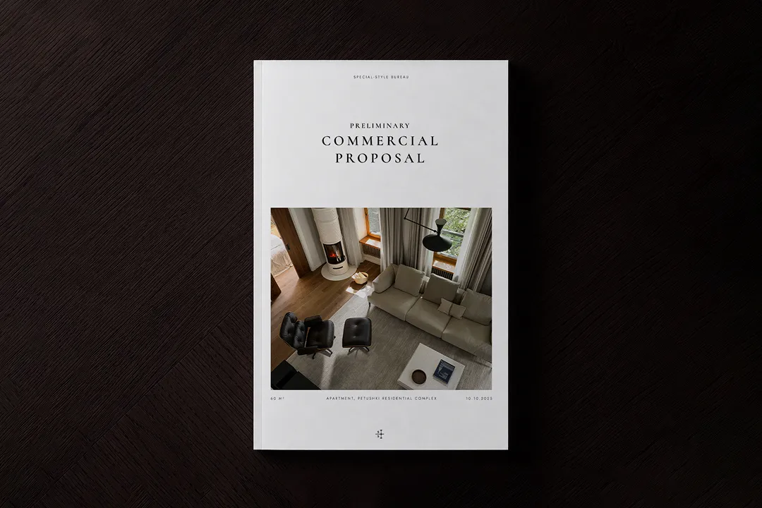
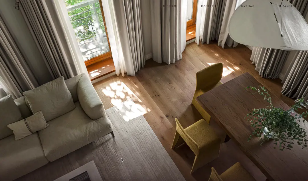
Special-Style is an award-winning interior design studio with 20 years of experience. The studio works on every stage of a project: from the first moodboards to construction supervision. The studio's visual identity comes from the world of technical drawings and inspired by influential interior magazines.


Whispers in My Ear
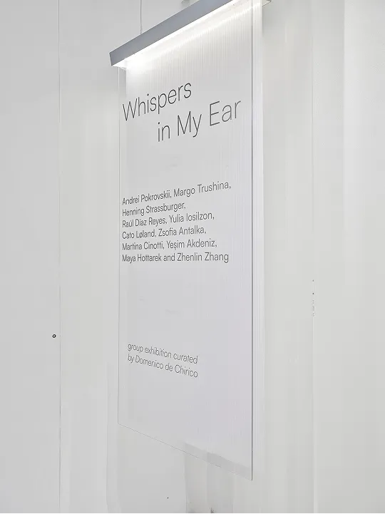
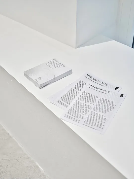
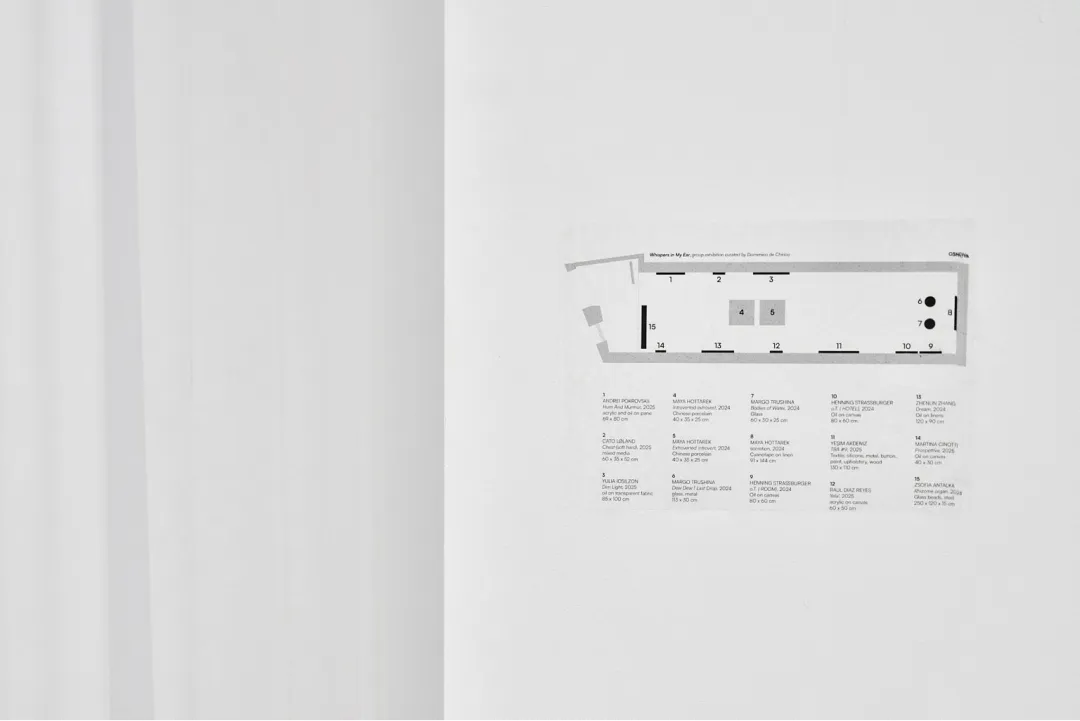
Whispers in My Ear is a group show organised by Osnova Gallery in Valencia, which commissioned the design of the printed materials for the exhibition. The goal was to follow the logic of the white cube gallery space and remain neutral, so the design would not compete for attention with the artists' works.
Haiide
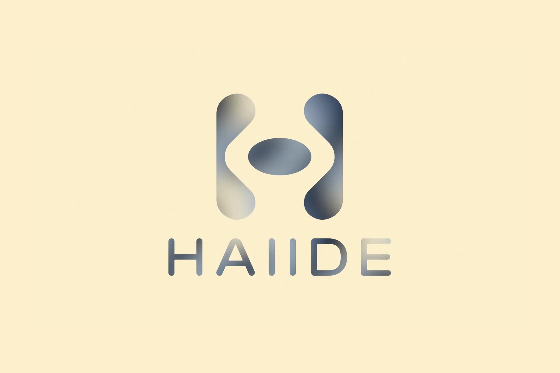
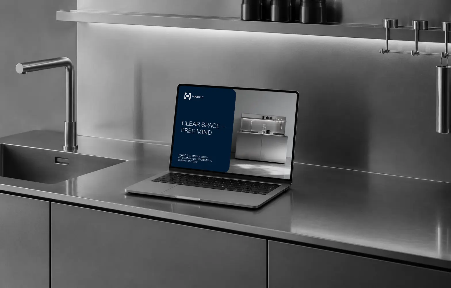
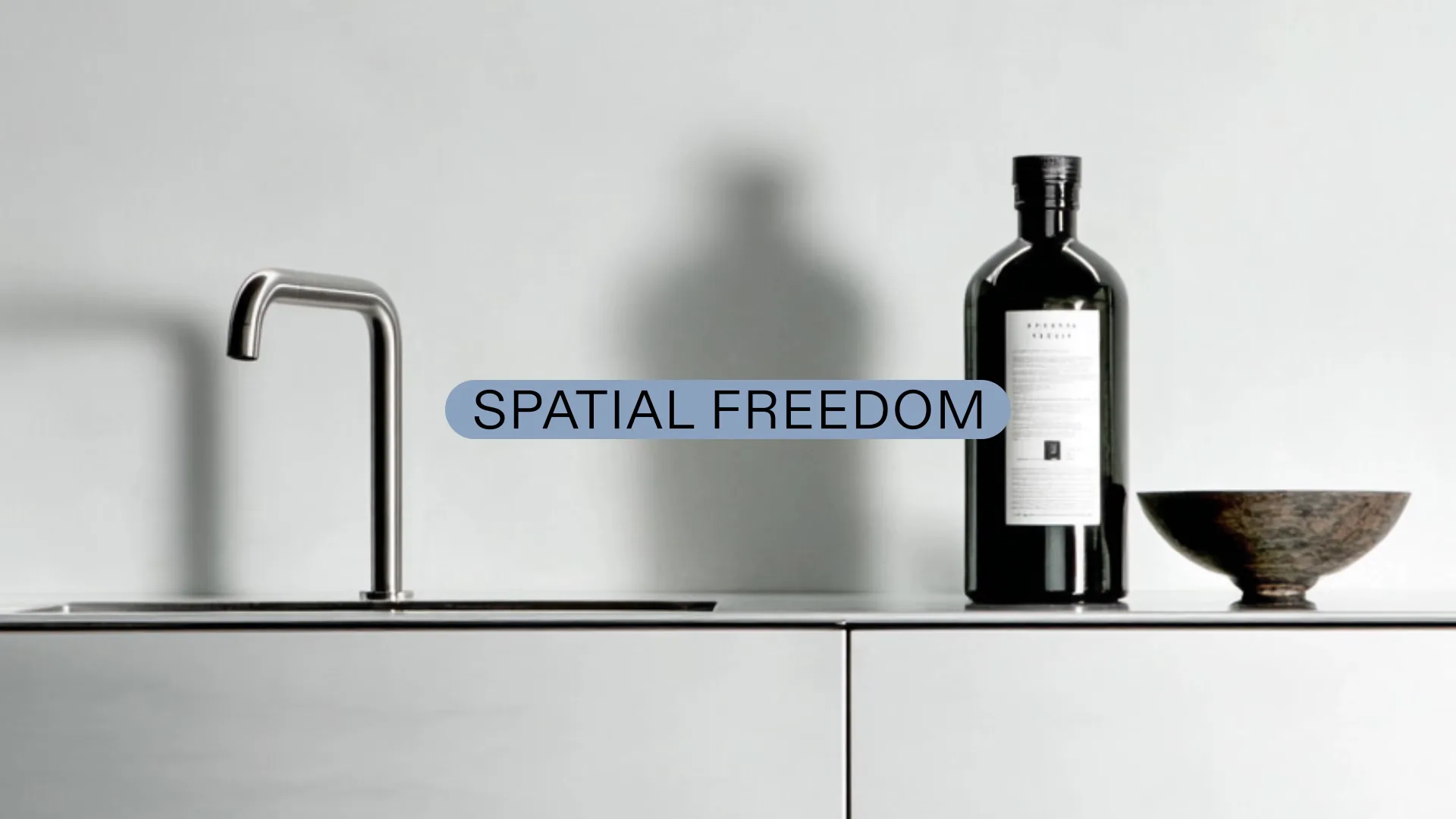
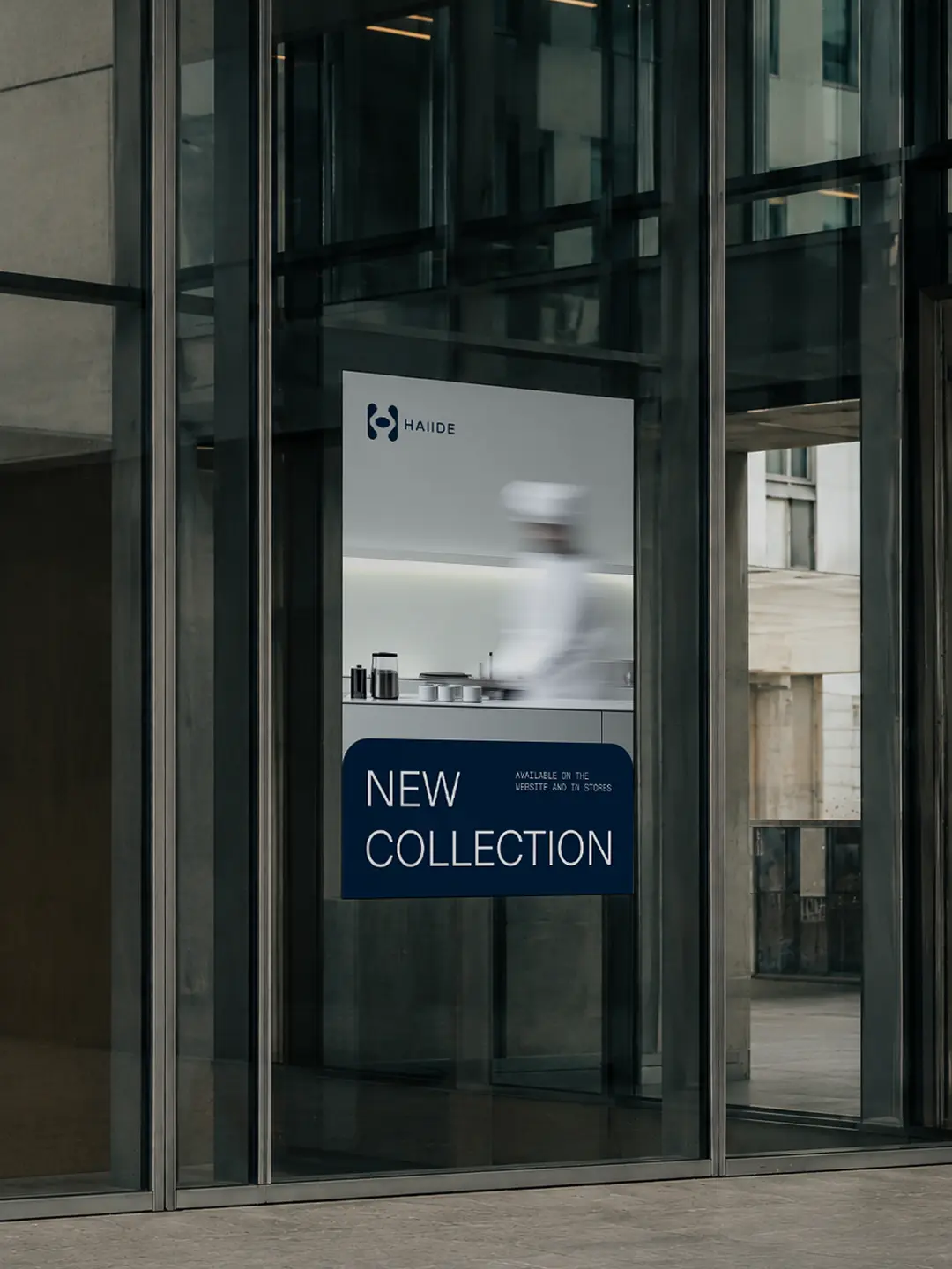
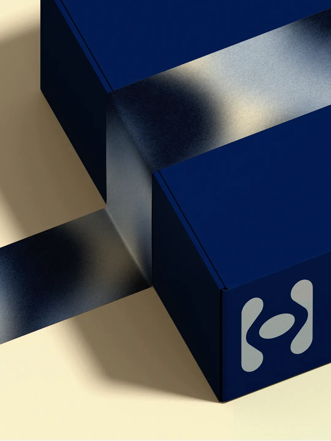
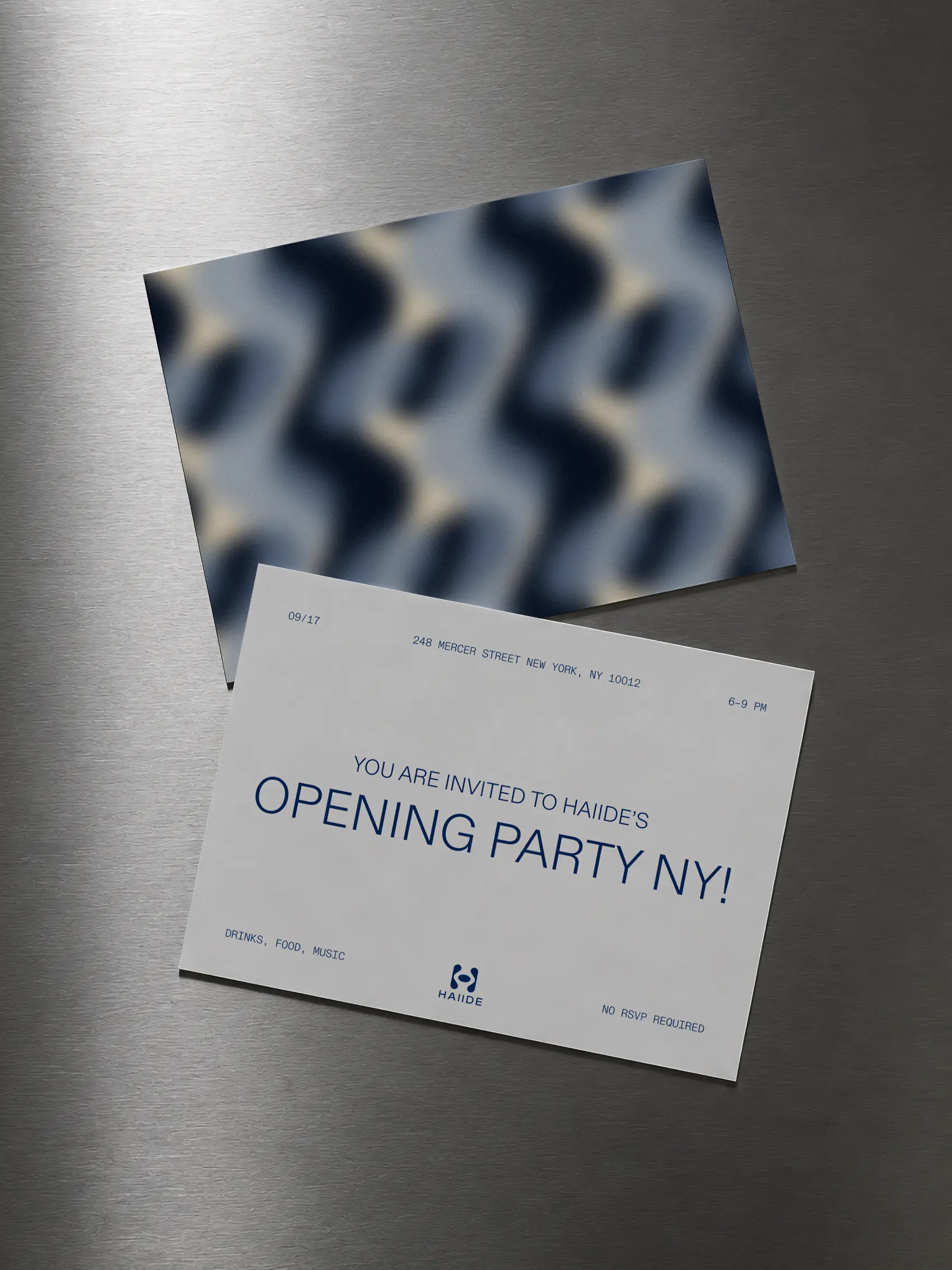
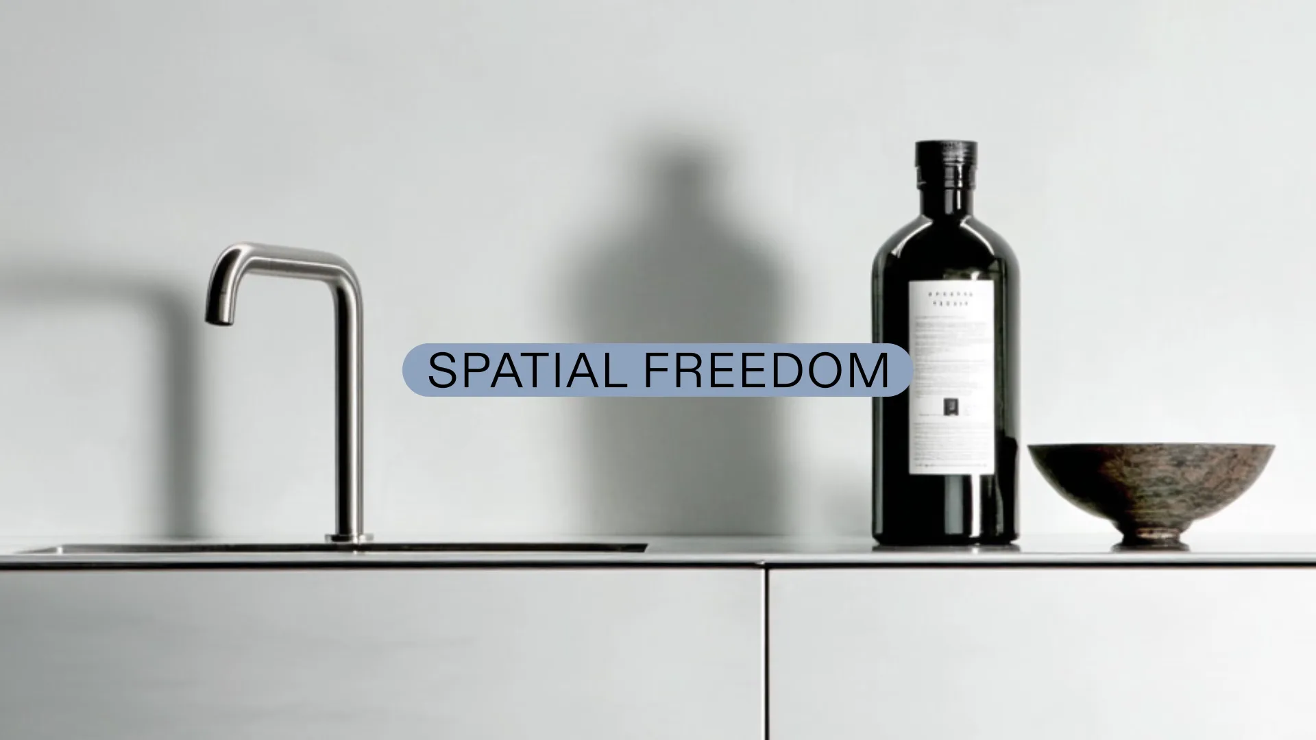
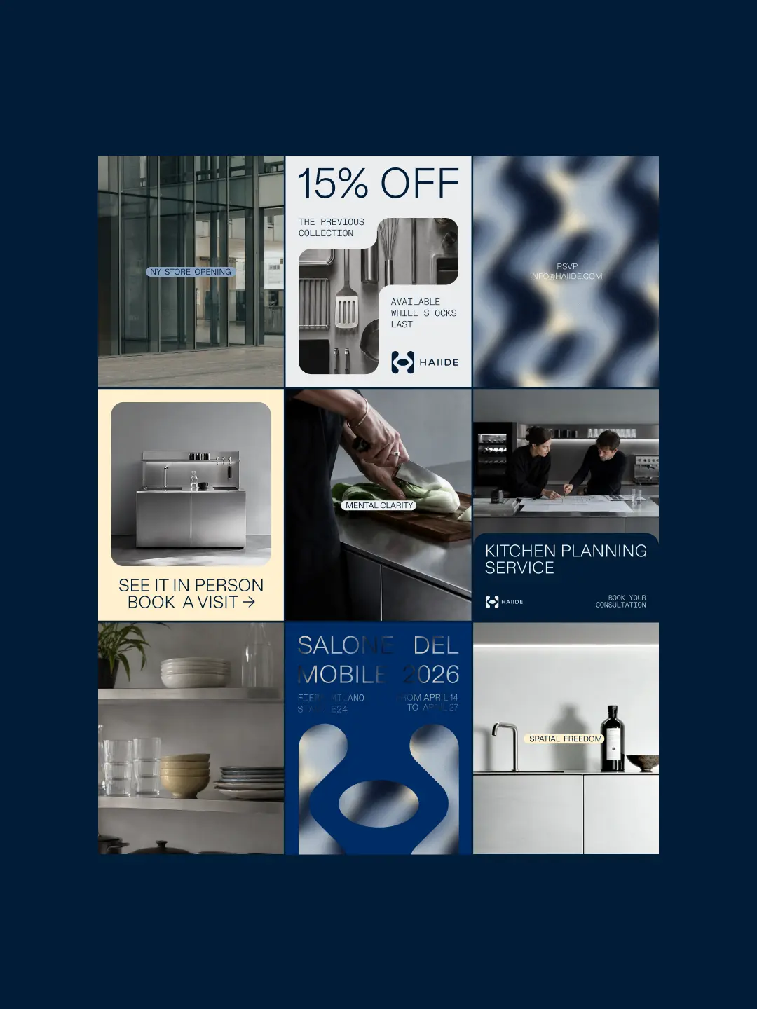
Haiide is a kitchen brand that brings clarity, calmness, and harmony into everyday life by optimising space and embracing simplicity. The brand's values are reflected in its visual identity through minimalist design and the metaphor of a calming water surface in motion, expressed through both the pattern and the colour palette.


(un) Bar Meneghino
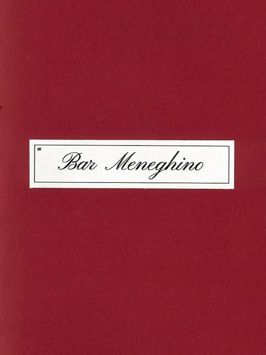
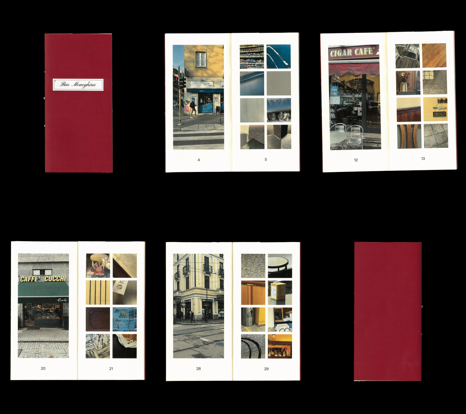
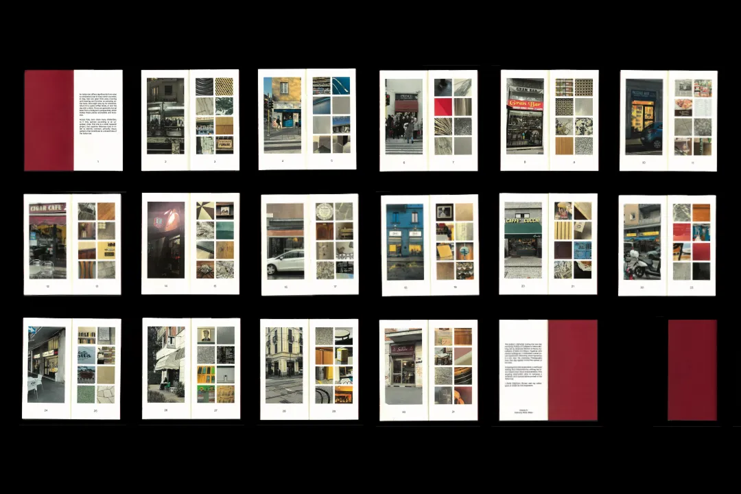
Bar Meneghino is a self-initiated research project that explores a visual language shared by the bars across Milan. Through repeated fieldwork and photographic documentation, it collects the recurring fragments that together compose the recognisable identity of the Italian bar. The format of the zine resembles a menu, while the caption on the cover references the look of a bar's signboard.
Bio-based Alternative for Ceramics
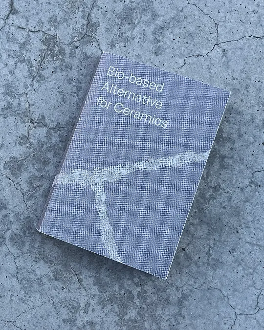
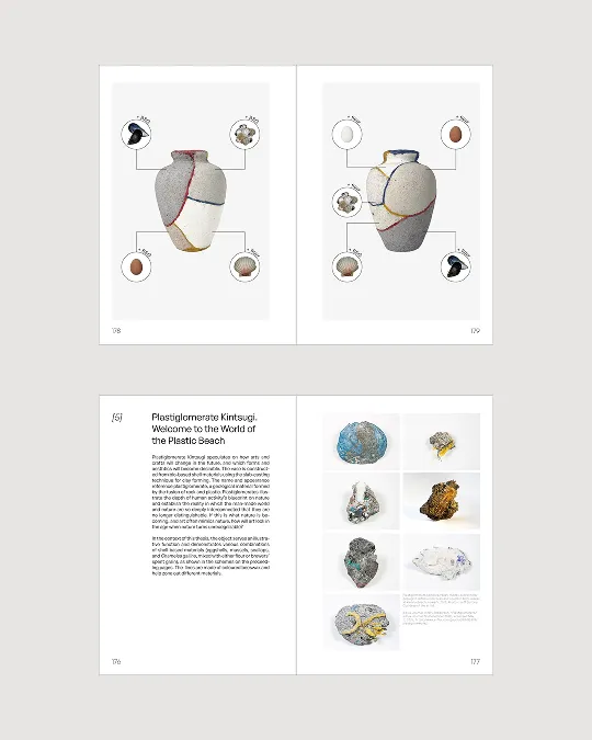
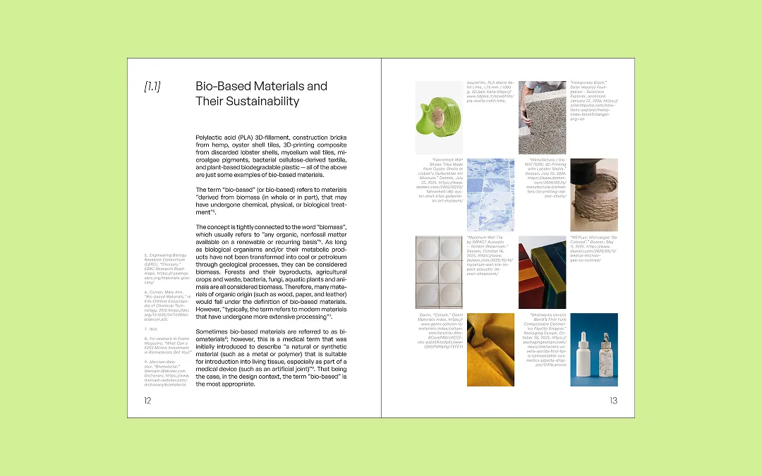
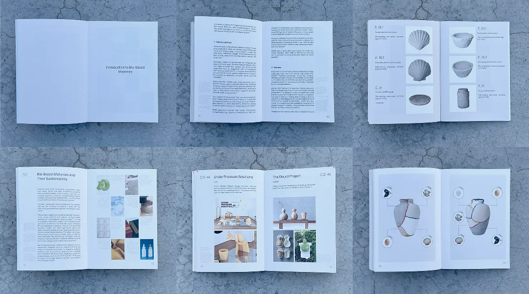
This book presents an experimental thesis investigating shell-based sustainable alternatives to ceramics. The design had to hold both the theoretical and the experimental halves of the research comfortably within one volume. The layout is built to meet the demands of academic text, accommodating footnotes, citations and referencing.
Urban Vibes
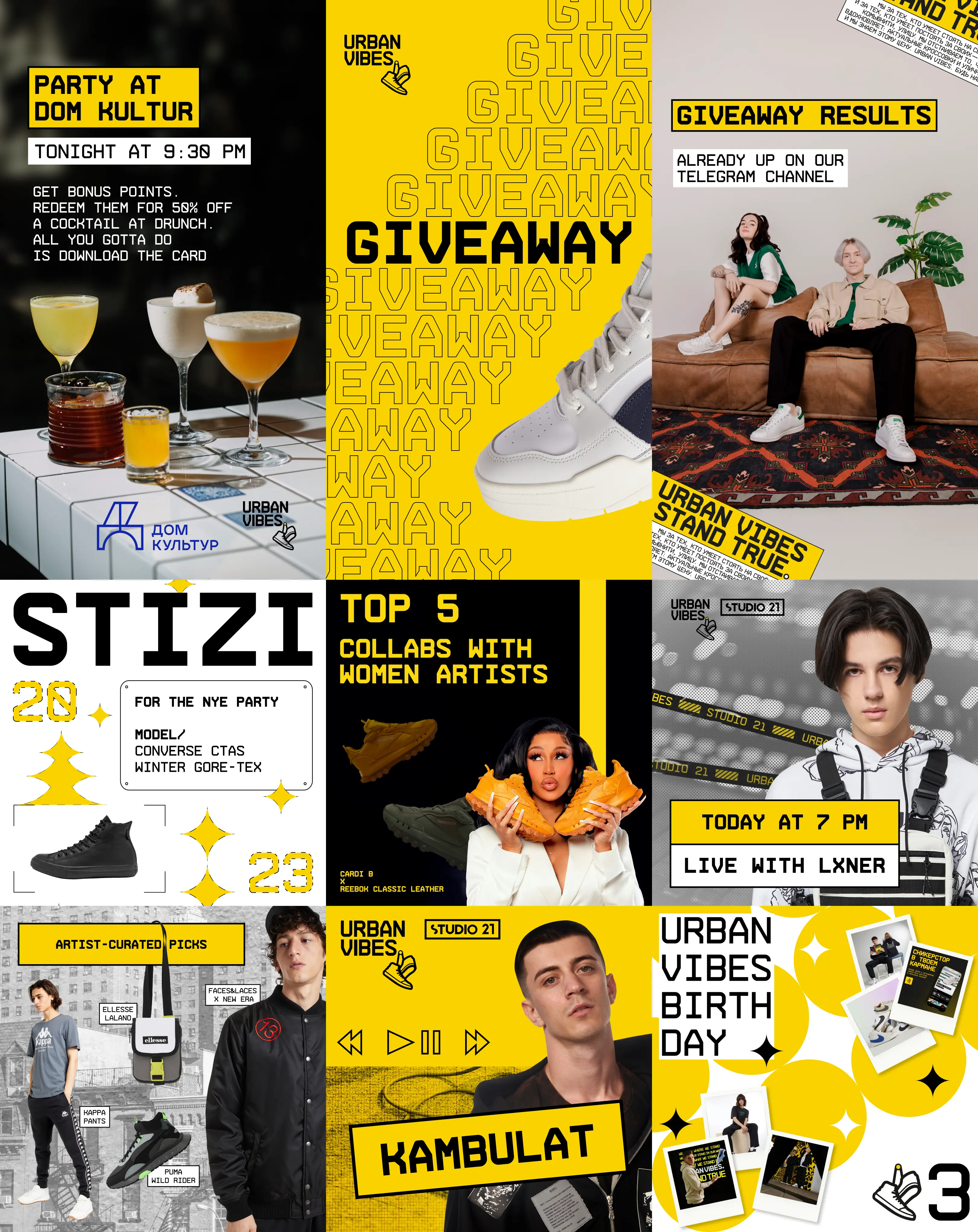
While working at communication agency MONSTARS, I created a series of social media visuals for Urban Vibes (a sneaker store rooted in street style and rap culture) following the brand guidelines and the specific visual styles of their advertising campaigns.
Kinetic Syntax
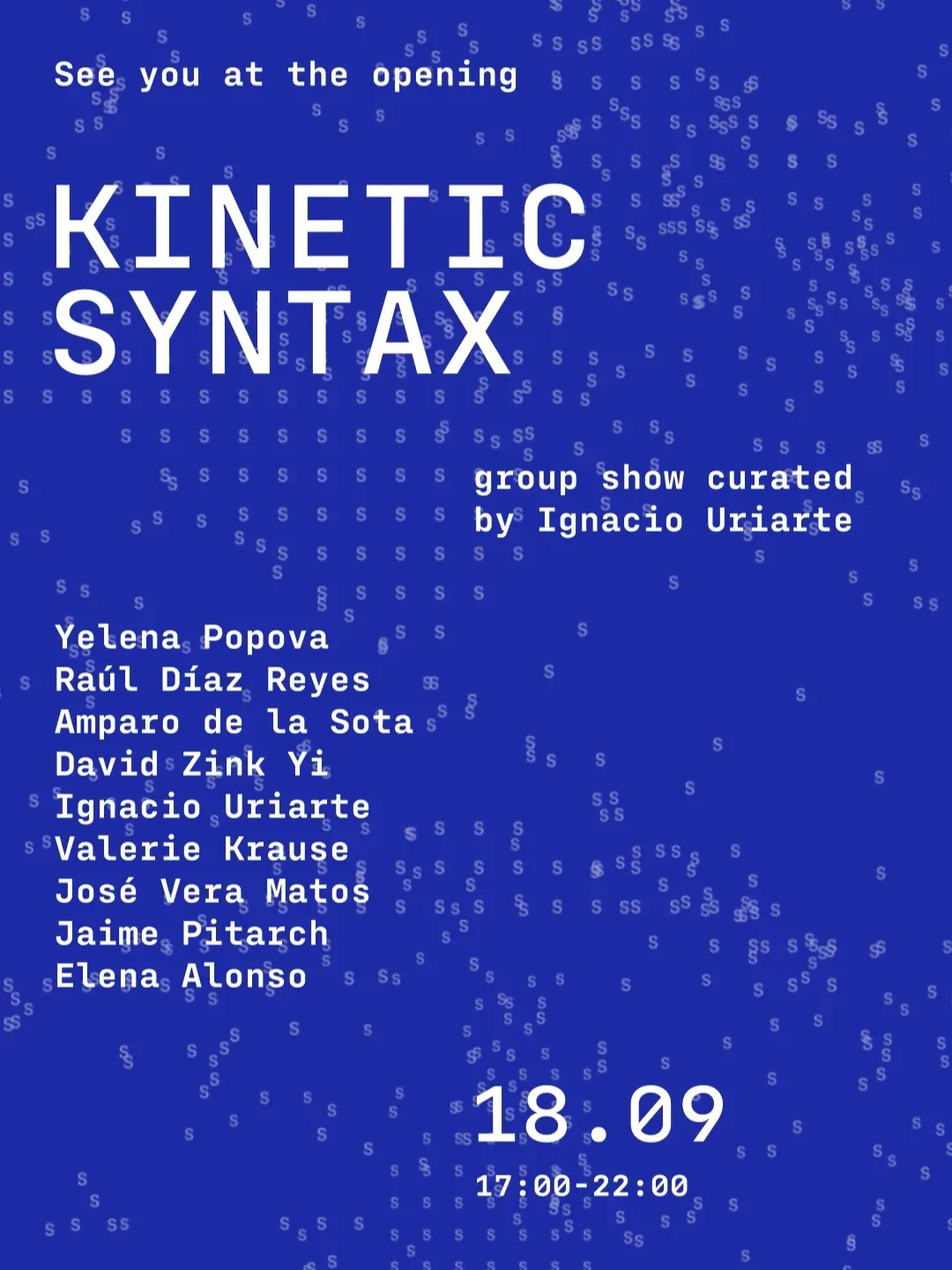
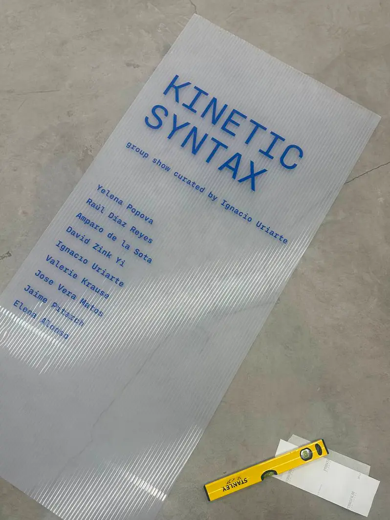
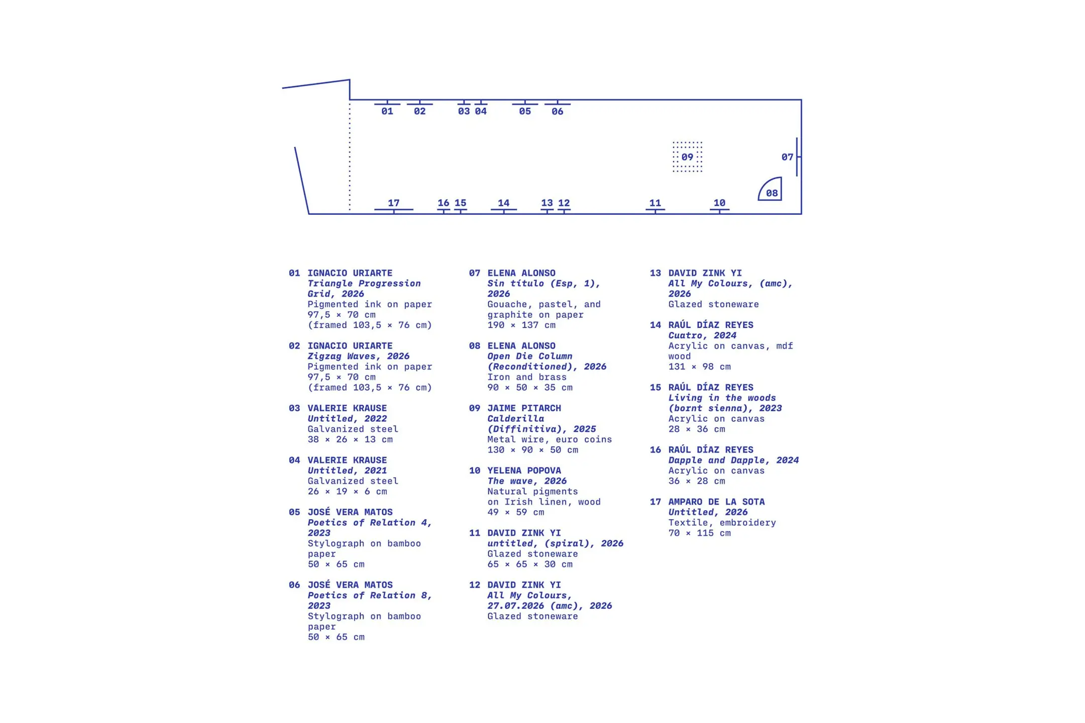
Kinetic Syntax is a group exhibition at Osnova Gallery in Valencia. It explores semiotics through kinetic art. The exhibition's theme is expressed through kinetic typography animation.
Spark
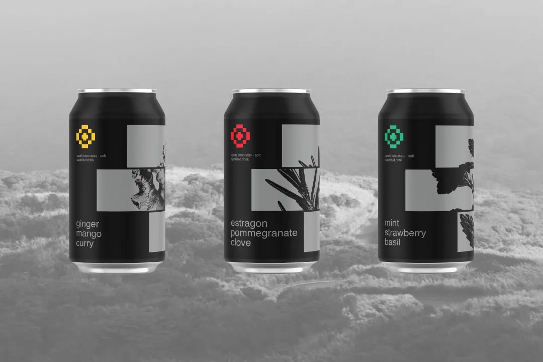
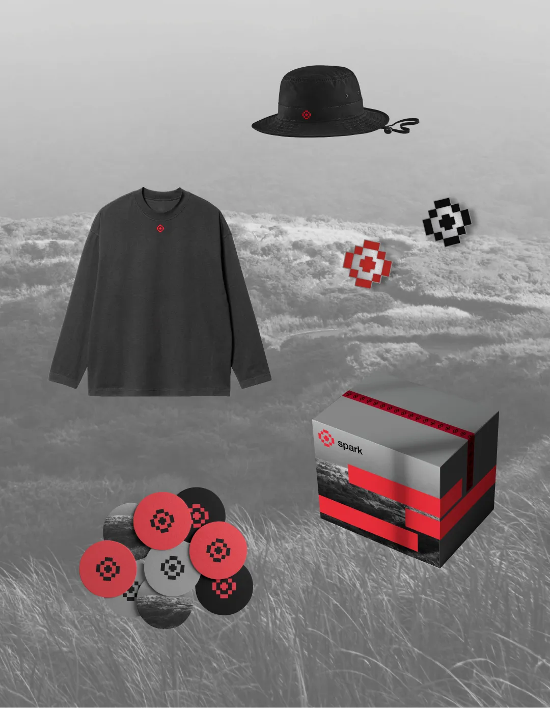
Spark is a non-alcoholic carbonated drink created to give people a place at the bar without alcohol: an invitation to explore unexpected flavour combinations while sharing the same social ritual. To belong in that setting, Spark shifts away from the vivid visual language typical of lemonade branding and adopts a darker, stricter tone of voice. Spark is not sweet; it is tasteful.

Hosta
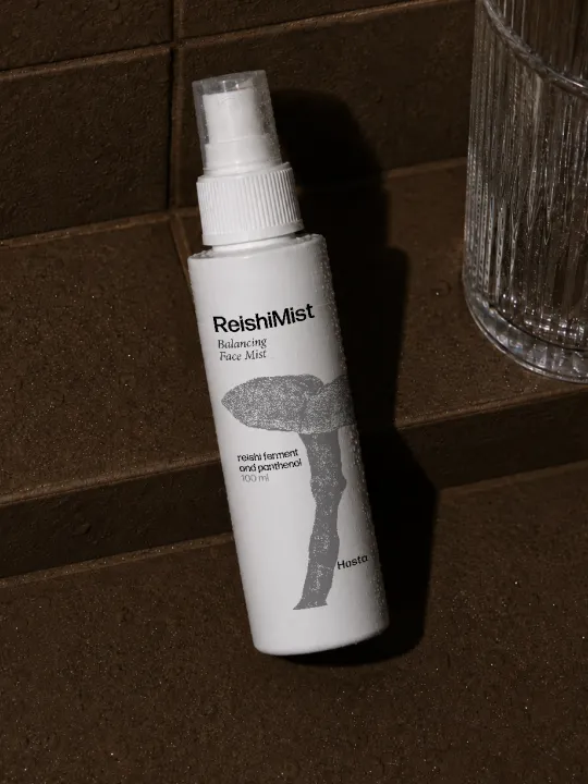
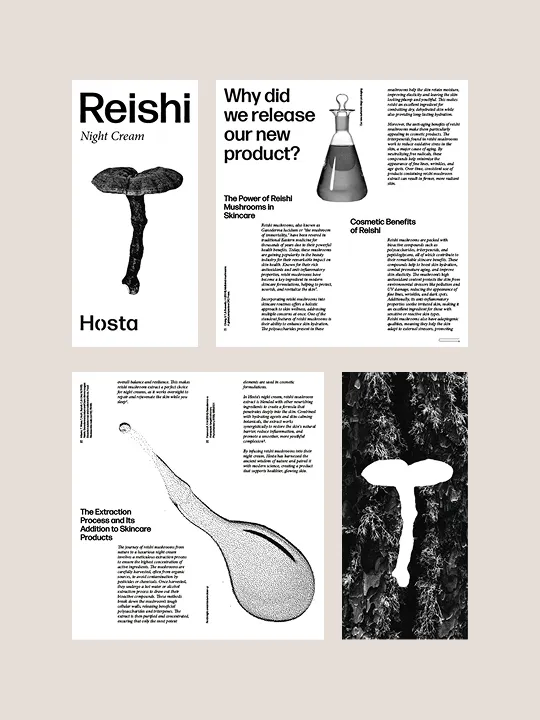
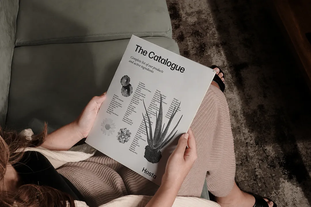
Hosta is a cosmetics brand built on science and simplicity. Initiated within a typography course at Bang Bang Education, the identity is deliberately type-led. It pairs the exactitude of laboratory precision with a softness that speaks to the gentleness of the formulations. The visual system communicates that the brand's attention to the ingredients and composition is a sign of care.